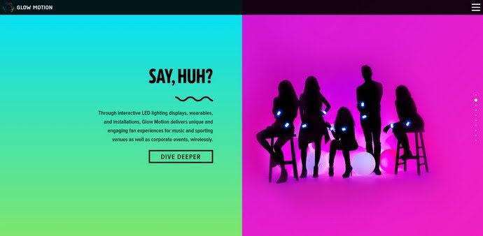
In the world of web design, the use of colour can make or break a website. Colours evoke emotions and can influence the perception of a brand. Bold colours, in particular, have the power to make a strong statement and capture attention.

Bold colours create visual interest and attract the eye. They can be used to highlight important information, create a sense of energy, and evoke strong emotions. Additionally, bold colours can be used to convey a specific brand personality, making a website more memorable and impactful.
When used effectively, bold colours can also help create a clear visual hierarchy, guiding the viewer’s eye to the most important information on a page.
Choosing the right bold colours is crucial to the success of a web design project. The colours chosen should complement the brand’s overall aesthetic, as well as the message being conveyed.
It’s important to consider the psychology of colour when making your selections. For example, red is often associated with excitement, while blue is associated with trust. By understanding the emotional associations of colours, designers can make informed choices that accurately represent their brand.
While bold colours are powerful, it’s important to use them in moderation. Overuse of bold colours can create visual clutter and make a website overwhelming.
Designers should aim to strike a balance between using bold colours to draw attention, and using them in a way that doesn’t overpower the rest of the design. This can be achieved by pairing bold colours with neutral colours, or by using bold colours as accents within a design, rather than as the dominant colour.
There are many examples of successful use of bold colours in web design. A few popular websites that make use of bold colours include:

In conclusion, bold colours can be a powerful tool in web design. When used effectively, they can draw attention, evoke emotions, and make a website more memorable and impactful. However, it’s important to use bold colours in moderation, and to choose colours that complement the brand and message being conveyed. By understanding the psychology of colour and using it to your advantage, designers can create websites that truly stand out.
References:
You must be logged in to post a comment.