Vintage and retro styles aren’t just limited to fashion. These aesthetics can also be incorporated into website design to create a unique and nostalgic online experience. In this blog, we explore the elements of vintage and retro styles in website design and provide tips on how to incorporate these elements into your own website.
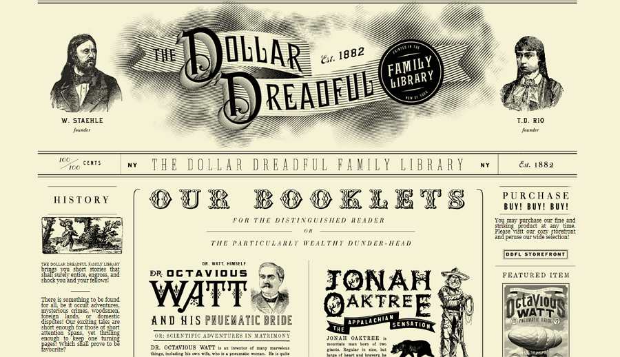
Vintage and retro styles in website design are characterised by certain elements that help to create a sense of nostalgia and a connection to the past. Some of the key elements of vintage and retro styles in website design include:
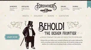
Retro colour schemes are typically muted, with pastels and earth tones dominating. Vintage color schemes, on the other hand, tend to be bold and bright, often featuring primary colors.
Vintage and retro typography is often bold and attention-grabbing, with decorative flourishes and serifs. Sans-serif fonts are less common in vintage and retro designs.
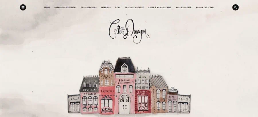
Vintage and retro designs often feature illustrations and graphics that are reminiscent of a bygone era, such as old advertisements or posters. Photographs may be used, but they are often edited to have a more nostalgic feel.
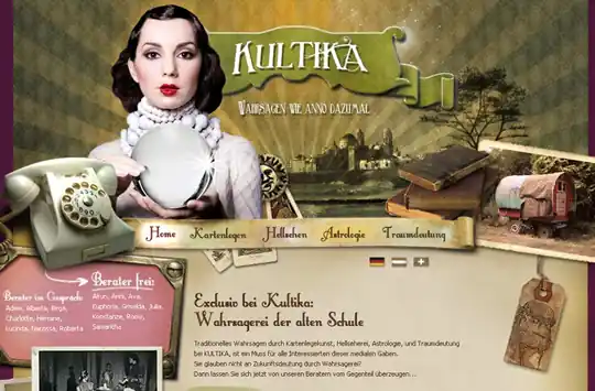
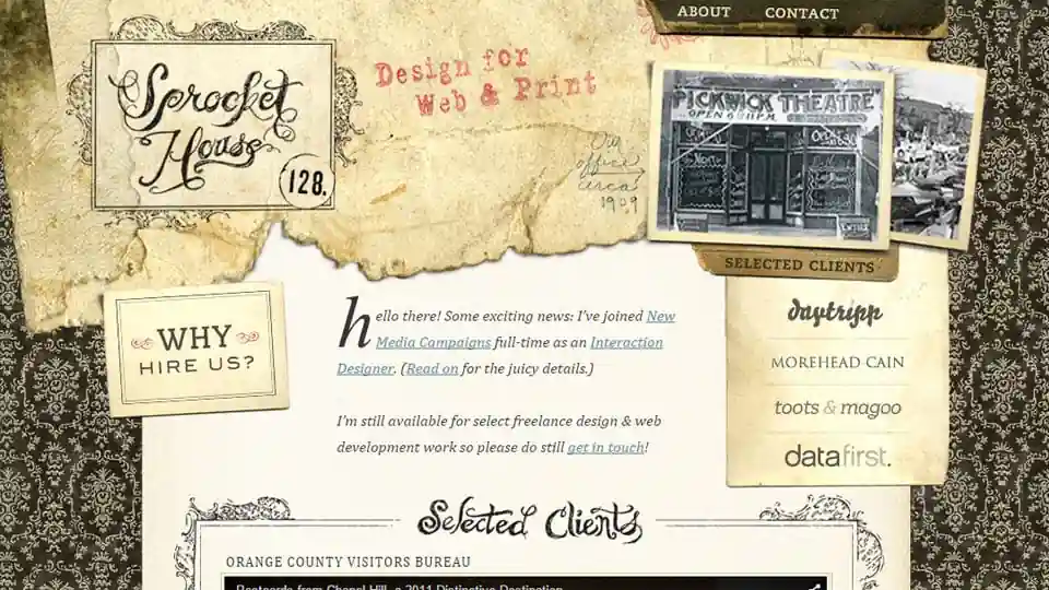
Vintage and retro designs often incorporate textures that give the impression of age, such as grainy paper or distressed wood.
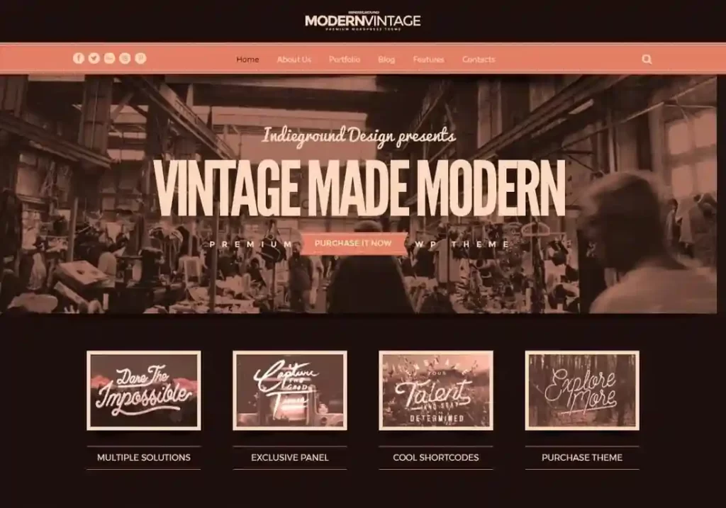
In conclusion, vintage and retro styles can be a great way to create a unique and nostalgic online experience. By incorporating the key elements of these styles into your website design and being consistent with your choices, you can create a website that stands out and captures the attention of your visitors
You must be logged in to post a comment.