The use of abstract shapes in website design has become a popular trend in recent years. From playful and quirky to minimalist and sleek, abstract shapes add a dynamic and engaging element to website design. Not only do they enhance visual appeal, but they also improve user experience by drawing attention to important information and guiding users through the website. In this article, we will explore the various ways in which abstract shapes can be used in website design and the benefits they offer.
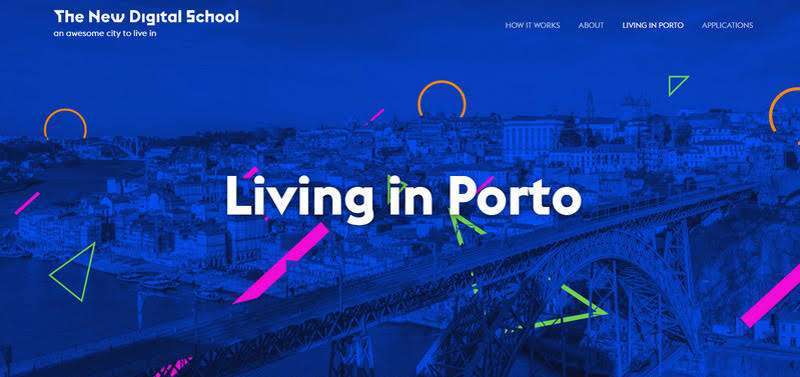
Abstract shapes refer to geometric shapes or forms that are not directly recognisable as real-world objects. These shapes can be simple or complex and can be used to create patterns, backgrounds, or as decorative elements on a webpage. They can also be used to create icons or illustrations, adding a unique and distinctive touch to a website’s branding.
Abstract shapes can enhance the visual appeal of a website by adding a creative and dynamic element to the design. They can help to break up text-heavy content and draw the eye to important information, such as calls to action or product features. By adding a touch of visual interest to a website, abstract shapes can make it more engaging and memorable for users.
Abstract shapes can also improve the user experience of a website by guiding users through the content. By strategically placing shapes and using them to highlight key areas of a page, users can quickly and easily navigate through the website. Additionally, abstract shapes can be used to create visual cues that help users understand the hierarchy of information on the page, making it easier for them to find what they are looking for.
Abstract shapes can also be used to create a unique branding identity for a website. By using consistent shapes and colors across the website, abstract shapes can create a distinctive and memorable brand identity. This can help to build brand recognition and increase brand loyalty among users.
Abstract shapes also offer website designers the opportunity to be creative and experiment with different design elements. By using abstract shapes in different ways, designers can create a unique and distinctive website that stands out from the crowd.
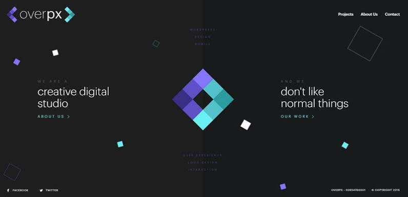
There are various ways to incorporate abstract shapes in website design. Some common methods include:
Abstract shapes can be used to create interesting and dynamic backgrounds and patterns for a website. By layering shapes and playing with color and transparency, designers can create a visually stunning backdrop that adds depth and texture to the design.
Abstract shapes can also be used to create icons and illustrations that represent different concepts or ideas. By using abstract shapes, designers can create unique and distinctive icons and illustrations that stand out from the usual stock images and clip art.
Abstract shapes can also be used to draw attention to calls to action and buttons on a webpage. By placing shapes around or behind these elements, designers can create a visual cue that draws the eye and encourages users to click through.
Abstract shapes can also be used to divide content into different sections. By using different shapes and colors, designers can create visual cues that help users navigate through the website and find the information they are looking for.
Here are some examples of websites that effectively use abstract shapes in their design:
Dropbox’s website uses a range of abstract shapes to create a playful and dynamic design. The shapes are used as backgrounds, icons, and call-to-action buttons, creating a consistent and visually appealing design.
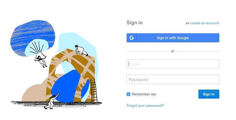
Mailchimp’s website uses abstract shapes in a fun and playful way, with shapes used as icons and illustrations throughout the design. The shapes are also used as section dividers, helping to guide users through the content.
Stripe’s website uses abstract shapes to create a minimalist and sleek design. The shapes are used as backgrounds and section dividers, creating a clean and organized design that is easy to navigate.

SquareSpace’s website uses abstract shapes in a bold and impactful way. The shapes are used as backgrounds and call-to-action buttons, creating a visually stunning and memorable design.
While abstract shapes can add a unique and engaging element to website design, there are a few things to keep in mind when using them:
When using abstract shapes, it’s important to maintain consistency throughout the design. This means using the same shapes and colors throughout the website to create a cohesive and unified design.
Abstract shapes should enhance the user experience, not detract from it. This means using shapes in a way that is clear and easy to understand, rather than creating confusion or distraction.
Abstract shapes should have a purpose in the design. They should be used to enhance the visual appeal or improve the user experience, rather than being used for the sake of using them.
It’s important to consider accessibility when using abstract shapes. This means ensuring that the shapes are visible and distinguishable for all users, including those with visual impairments.
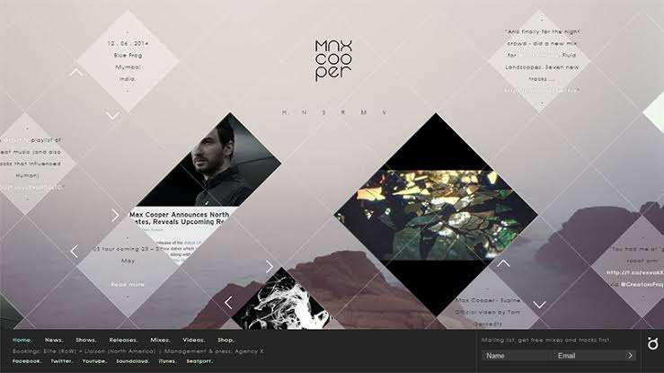
Abstract shapes are a versatile and engaging design element that can enhance the visual appeal and user experience of a website. By using abstract shapes in strategic and purposeful ways, website designers can create a unique and memorable website that stands out from the crowd. Whether used as backgrounds, icons, or section dividers, abstract shapes offer a range of design possibilities that can inspire creativity and add a dynamic and engaging element to website design.
You must be logged in to post a comment.