Typography is a crucial element in web design, serving as the voice of your website’s content and shaping the visual identity of your brand. In this article, we’ll be taking a closer look at bold typography in web design and how it can be used to make a statement with type.
What is Bold Typography?
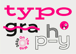
Bold typography refers to the use of thick, heavy letterforms in design. It’s a typeface that has been designed with thicker strokes than the regular weight, making it stand out and grab the reader’s attention. Bold typography is often used to create emphasis, draw attention to specific elements, or create a sense of hierarchy in a design.

Why Use Bold Typography in Web Design?
There are many reasons why you might choose to use bold typography in your web design. Here are a few of the key benefits:
Emphasis
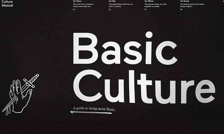
Bold typography can be used to emphasise important text, such as headings or calls to action, helping to guide the user’s eye to the most important information on the page.
Hierarchy
Bold typography can be used to create a visual hierarchy, helping to distinguish between different levels of headings and subheadings.
Contrast
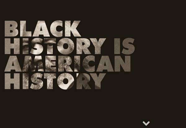
Bold typography can be used to create contrast within a design, making certain elements stand out and drawing attention to specific areas of the page.
Impact
Bold typography can be used to create a sense of impact, making a statement and grabbing the reader’s attention.
How to Use Bold Typography in Web Design
Using bold typography effectively in web design requires careful consideration of the context in which it’s being used, as well as the design elements surrounding it. Here are a few tips to help you get started:
Keep it simple
Bold typography is most effective when used sparingly, so be careful not to overuse it.
Use it for emphasis
Bold typography is often used to emphasise important text, such as headings or calls to action, so make sure to use it in these contexts.
Create contrast
Bold typography is most effective when used in combination with other design elements, such as colour or images, to create contrast and draw attention to specific areas of the page.
Consider the typography
When choosing a bold typeface, make sure to consider the overall look and feel of the typography, as well as its legibility and readability.
Conclusion
Bold typography is a powerful tool in web design, allowing you to make a statement with type and create emphasis, hierarchy, contrast, and impact. By using it effectively and in combination with other design elements, you can create a visually stunning and impactful website that grabs the reader’s attention and conveys your message with clarity and precision. So next time you’re working on a web design project, don’t be afraid to use bold typography and make a statement with type!
References:
- “What is Bold Typography?” Design Shack, https://designshack.net/articles/typography/what-is-bold-typography/.
- “The Power of Bold Typography in Web Design.” WebFX, https://www.webfx.com/blog/web-design/the-power-of-bold-typography-in-web-design/.
- “Typography in Web Design: The Basics.” Smashing Magazine, https://www.smashingmagazine.com/2017/03/typography-web-design/.
- “The Importance of Typography in Web Design.” UX Design, https://uxdesign.cc/the-importance-of-typography-in-web-design-a5f5c5f5f4e5.
- “Bold Typography in Web Design: Making a Statement with Type.” Creative Bloq, https://www.creativebloq.com/inspiration/bold-typography-in-web-design-making-a-statement-with-type.